

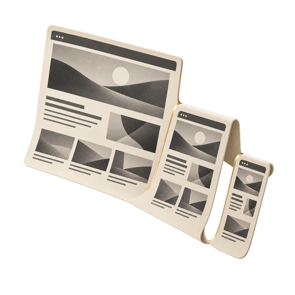
Why Mobile Web Development is Critical to Business Growth
Over 80% of digital traffic originates from mobile devices, where purchasing and contact decisions happen in seconds. If headings awkwardly wrap, navigation is buried, buttons are outside thumb reach, or the virtual keyboard hides form fields, desktop beauty is irrelevant.
We treat mobile compatibility as a foundational architecture, not an afterthought breakpoint. We design for the smallest screen first: determining what content belongs above the fold, which secondary elements to defer, and how persistent bottom CTAs should anchor the user journey. Tablet and desktop views are built out from this high-speed mobile core.
Explore our related solutions for landing page design and comprehensive corporate website development.
The Seobify Difference in Mobile Web
Adding a CSS media query is not mobile engineering. The goal is enabling mobile visitors to accomplish their objective with one hand and zero friction.
True Mobile-First Architecture
We do not simply stack desktop columns. Typography scales, content hierarchy, and sticky bottom action bars are conceived specifically for handheld screens.
Touch Target Precision
All clickable buttons and links maintain a 48x48px minimum hit target, eliminating accidental mis-clicks and frustrating zoom behaviors.
Mobile Core Web Vitals Discipline
Sites engineered to load instantly even on 4G cellular networks, with preloaded hero visual assets, zero cumulative layout shifts (CLS), and low input delays.
Full Ecosystem Integration
Mobile excellence serves as the bedrock of our corporate websites and e-commerce stores from day one.
Who Needs Mobile-First Web Development?
Any company whose audience engages via smartphone and wants to stop losing conversions to slow, clumsy mobile pages.
Emergency Services and Local Businesses
Clinics, legal practices, and contractors where users require instant tap-to-call, click-for-directions, or quick WhatsApp contact.
Brands Running Meta and Google Ad Campaigns
Marketing teams driving mobile ad traffic that requires frictionless form fields, instant load times, and distraction-free mobile journeys.
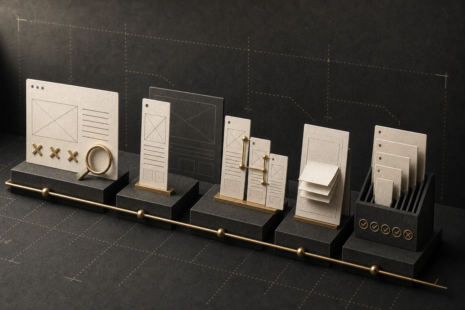
Businesses Modernizing Clunky Legacy Sites
Websites that technically resize but feel slow and uncooperative on handheld devices, suffering from low mobile inquiry rates.
Where Mobile Optimization Fits Into Your Stack
Mobile responsiveness is the touchpoint through which almost every visitor interacts with your digital channels:
What You Receive in a Mobile Web Project
All mobile layouts are verified on physical iOS and Android hardware before production sign-off.
- 01Mobile-First Information Hierarchy
Strategically prioritized content pacing and sticky action bars for quick conversions.
- 02Fluid Responsive Breakpoints
Flawless rendering across compact phones, foldables, tablets, and wide monitors.
- 03Touch & Keyboard Ergonomics Testing
Form inputs that don't zoom automatically and stay clear of the software keyboard.
- 04Speed & Cellular Data Optimization
Next-gen WebP/AVIF imagery, font preloading, and asynchronous asset loading.
- 05Hardware Compatibility Matrix
Full cross-device testing across iOS Safari, Chrome, and Samsung Internet.
This service covers browser-based responsive web applications. Native iOS/Android App Store development is quoted separately.
Our Mobile Engineering Workflow
We prototype and approve the compact mobile screen first, then expand outward to tablet and desktop layouts.
Mobile UX Audit
Identifying friction points, slow scripts, and mobile drop-offs on current pages.
Handheld Viewport Design
Prioritizing core content, typography hierarchy, and thumb-reach zones.
Responsive Coding
Lightweight CSS Grid, flexbox systems, and native touch gesture support.
Speed & Vitals Optimization
Asset compression, deferred non-critical scripts, and sub-second load times.
Physical Hardware QA
Testing navigation, interactive menus, and checkout flows on real devices.
Responsive Resizing vs. True Mobile UX: What's the Difference?
Having a fluid CSS grid merely means content shrinks to fit the viewport width; it does not guarantee usability. Stacking desktop elements three levels deep or concealing everything behind a generic hamburger menu does not create an intuitive mobile experience.
True mobile web design acknowledges that users navigate with one thumb. Buttons are positioned within the natural touch arc, inputs are simplified, and pages open instantly on 4G connections. When driving paid media, pairing this with dedicated landing page design yields maximum ROI.
Why Does Mobile Speed Directly Determine Revenue?
Mobile users are significantly less patient than desktop users. If a page takes longer than 3 seconds to render, over 50% of visitors abandon the session. Compressing visuals, serving critical CSS inline, and eliminating render-blocking scripts directly drives conversions.
How Mobile Web Development Pricing is Structured
Pricing reflects template volume, CMS flexibility, custom navigation modules, and targeted mobile performance budgets.
Request a tailored mobile project quote →Frequently Asked Questions About Mobile Web Development
Can you optimize my existing website without a full rebuild?
Yes. If your current theme or CMS permits, we can refactor mobile CSS stylesheets, optimize touch ergonomics, and streamline mobile page flows without touching your desktop structure.
How does mobile performance impact Google SEO rankings?
Google enforces Mobile-First Indexing across the web. Your mobile layout, page speed, and touch usability are the primary factors determining all organic Google rankings.
Will the website function seamlessly on all smartphone models?
Yes. We rigorously test across iOS Safari, Android Chrome, Samsung Internet, and various viewport aspect ratios to guarantee flawless performance.
Does a responsive mobile website replace the need for an app?
For the majority of service and commerce businesses, a fast, lightweight mobile web application offers far lower customer acquisition costs and zero download friction compared to native app store apps.
Turn your mobile visitors into paying customers
Share your current website link. We will audit your mobile touch friction and speed opportunities in an initial consultation.